About the project and problems
noyah is a clean beauty brand, who makes their products with the most natural ingredients, including products made 100% from food.
Beside their offline retail stores and online merchant, their are looking for offering customers with a whole new shopping experience which would be able to represent their brand identity while costumers can explore key features of their products.
Current noyah world app is functioning, but full of problems. Client was complaining that key performance indexes, like Task Abandonment Rate, Task Time, are not ideal, so the app is not able to properly help the company on selling and branding.
noyah commissioned Virtual Fudge to optimize their mixed reality shopping experience, and I, as product designer and product prototyper, worked together with product manager, Unity developers, as well as noyah Magento team, and successfully optimized the product, significantly improved abandonment rate and task time. The new user experience design extended to the web end and improved the web end performance as well, the bounce rate got lowered from 43% to 29%.
Team & Role
- Product Manager
- Product Designer (me)
- Product Prototyper (me)
- Spatial Designer
- Marketing Team
- Branding Team
- Magento Team
- Engineering Team
Impacts
Task Abandonment Rate:
45% -> 0%
Task Time:
4'25" -> 1'15"
Website Bounce Rate:
43% -> 29%


Current App Analysis
After multiple rounds of tests, it is discovered current noyah world app is functioning, but users usually don’t know how it is supposed to be used. In other words, it is not able to properly help users as users expect.
This means there must be something wrong with its discoverability and its understanding.
Understanding
Understanding is about how easy users are able to picture the mechanism of the product function. Or in other word, the conceptual model of the system.
Discoverbility
Discoverability is about perception and interaction, more specifically it’s about affordances, signifiers, constraints, mappings and feedback.
Problem space B
2D Interaction
Problem space C
Spatial Interaction
Discoverability is how user perceive app's affordance, signifiers, constraints, mappings and feedback, it is about user to understand how to interact with the application.
2D Interaction
After many years of using smartphones, people have been passively trained to perceiving design systems and they can easily perceive the info through them. This is something should be utilized properly improve users cognition.
Before
The current shopping interface is not structured in a clear hierarchy, it is neither using common design patterns nor following a well developed design system. Users, especially those who are new to this app, need to spend a good amount of time figuring out how to get what they want. Beside that, the overall color pallet and the way it presents products are neither attractive or representative.


After
Strictly follow the systems for all interaction design on each page. So the overall design language is consistent and informative throughout, thus minimize the learn cost for potential users.


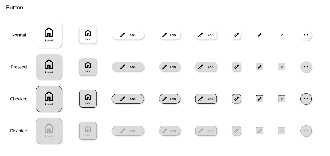
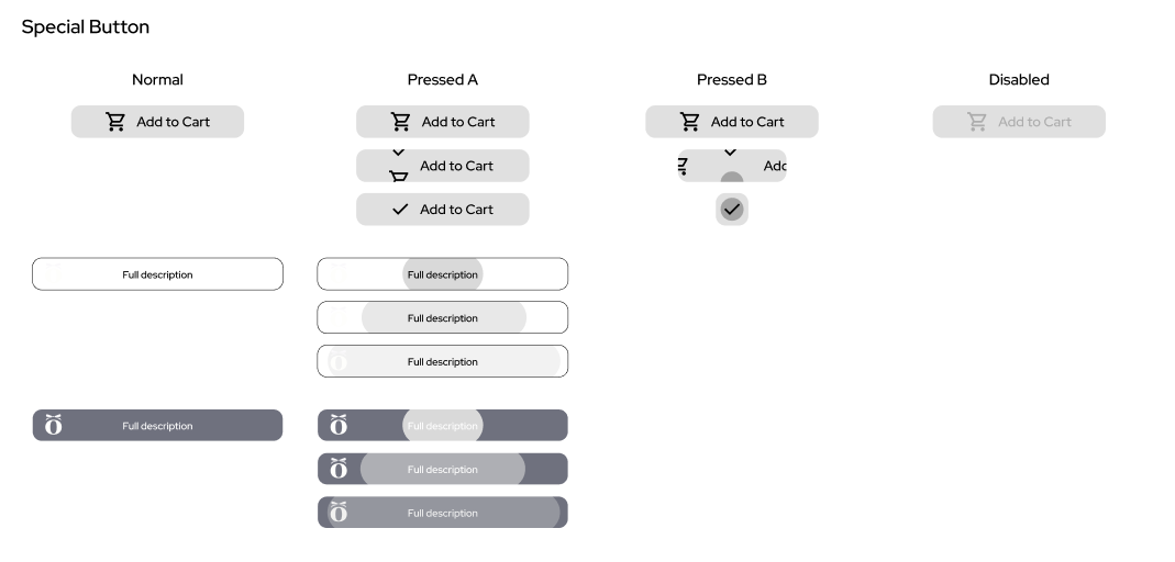
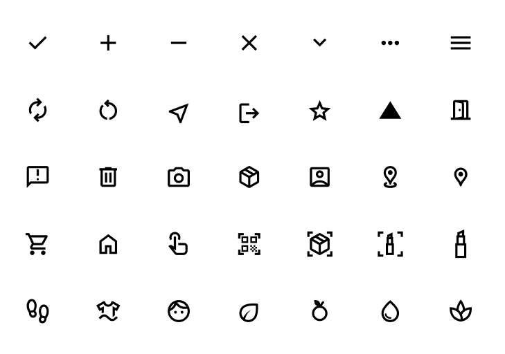
Design System
Based on multiple iterations and tests results, clearly define all UI elements, their visual design, status, animations, layout, sizes, color, transparency, hierarchy in all circumstance. So future development can directly refer to it.

Bottom Sheet Layout
Spatial Interaction
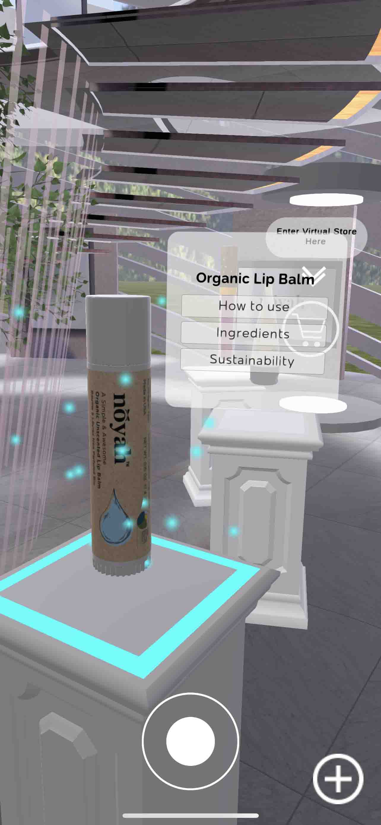
Spatial interaction is rarely considered in tradition mobile app, but it is crucial in this product. Since the virtual store is an opportunity to represents noyah brand identity, and offers a straightforward way to showcase the key features of each product line. However, the previous spatial interface is even more problematic than the 2D interaction. It not only lacks sufficient affordances, but also signifiers, constraints, mappings, as well as feedbacks are all not clear. This is fatal especially when the user experience gets extended to 3D space.
Before
The current overall space design is irrelevant to the either the brand or products All products are presenting with identical general pedestals; the menu popping up doesn't provide most important product information; the access to the shopping interface is a separate portal far away from each product; there is no clear sign or instructive items within the space, and the floating menu doesn't help with navigation either.

After
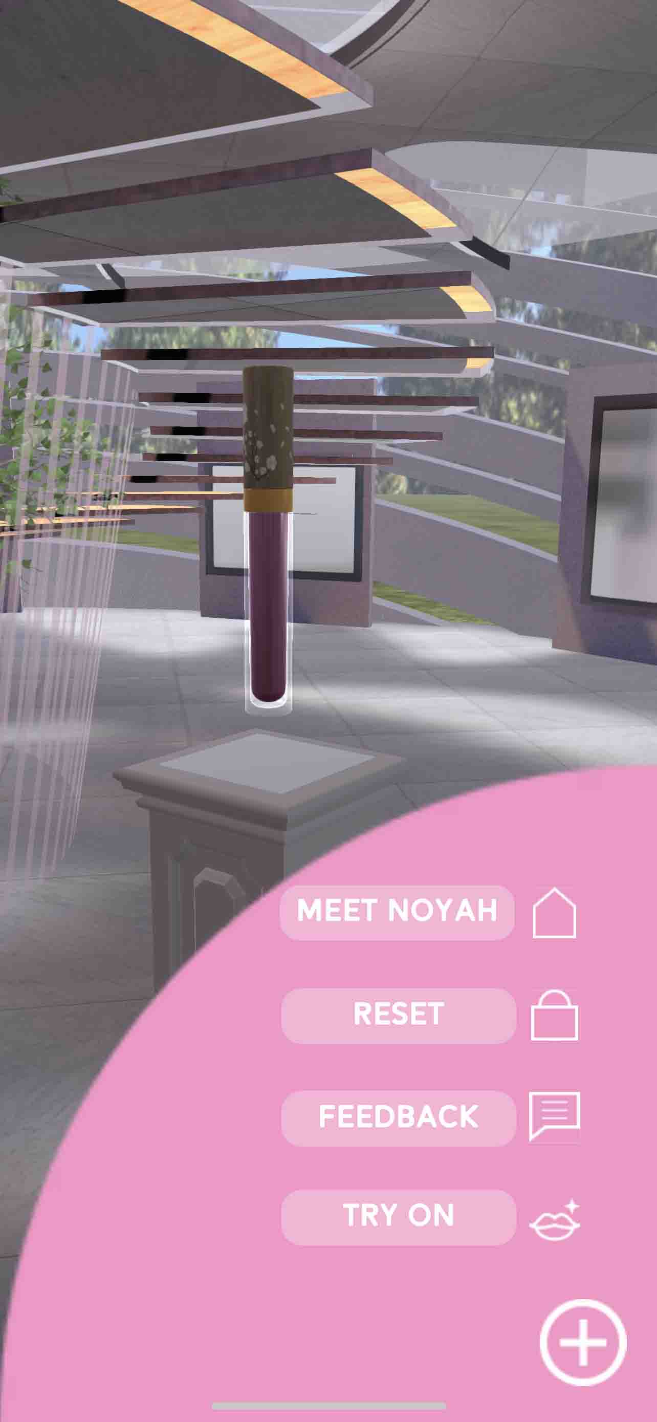
Implement the designs to the noyah virtual store, space around each stage adopt their theme so they are easily distinguished, pop up menus only pop up when users approach them, otherwise they will be hidden and simplified as a tag, thus to avoid users being overwhelmed and the space stay clean. Navigation menu provides quick access to the key destinations, so user can always find what they would like to go.

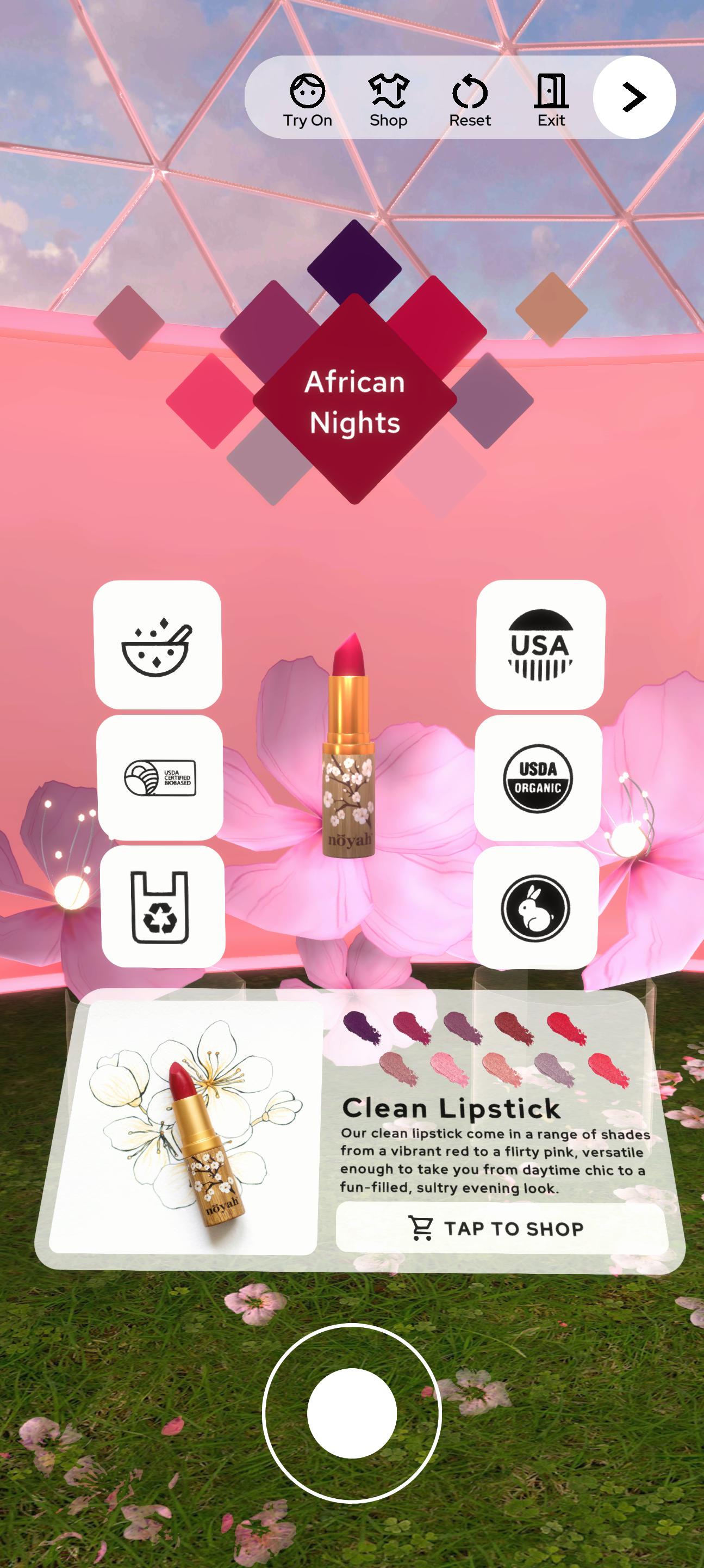
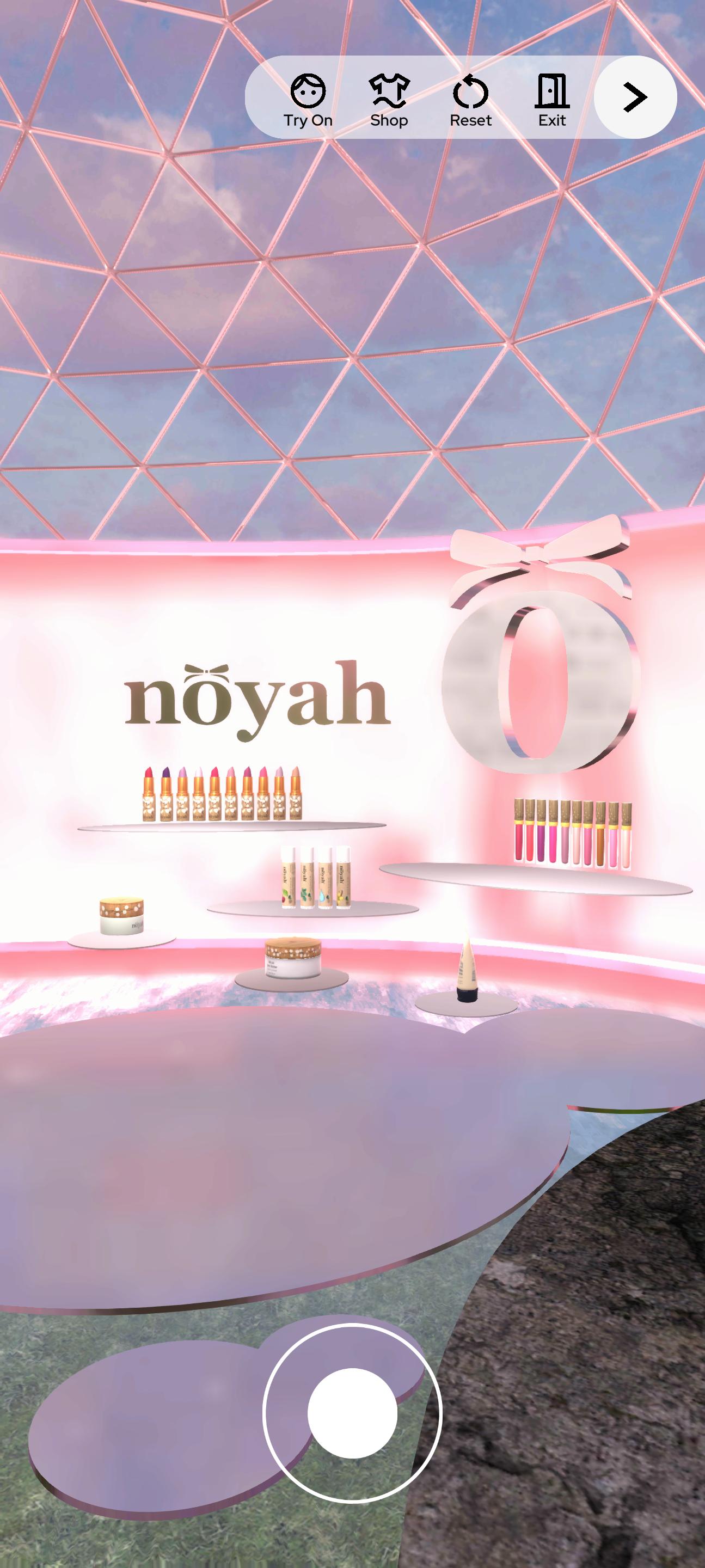
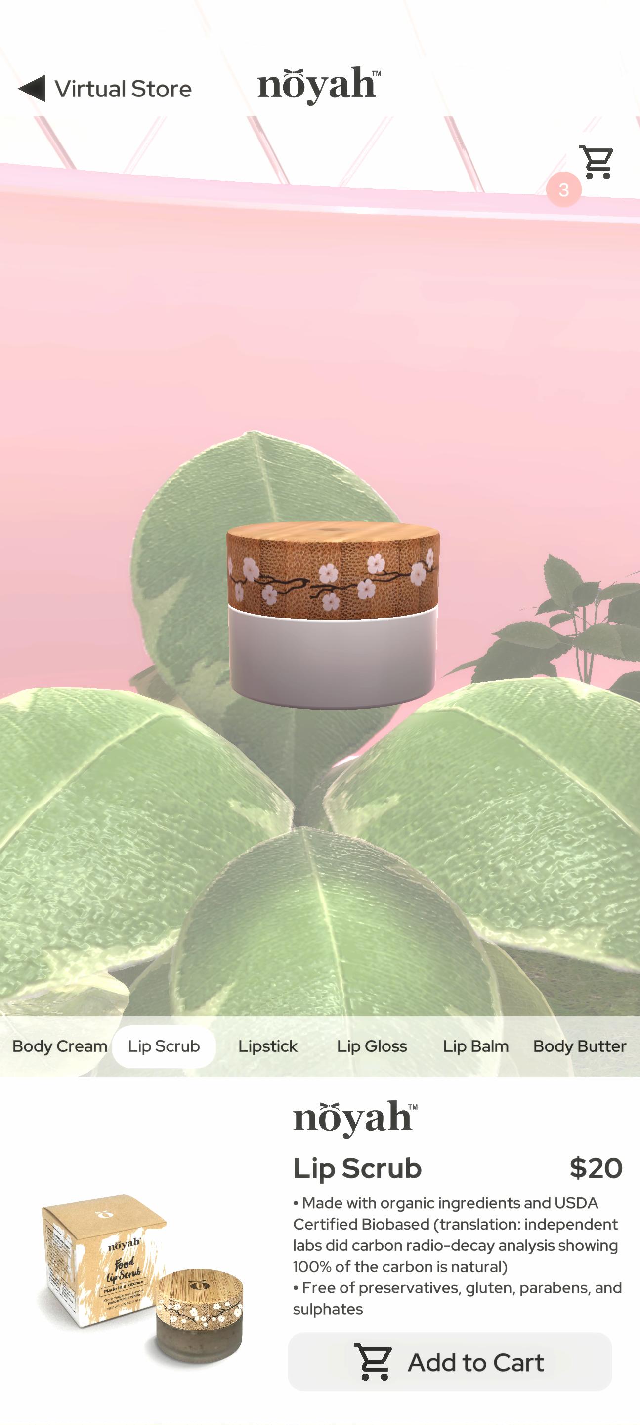
Spatial Design
Comparing to traditional mobile apps, 3D space is harder to navigate. With that being said, elements in the space need to be carefully designed, so users know where they are and where they would like to go. However, in return, beside the graphic and interface design commonly adopted in traditional mobile product to represent brand, the XR products offer additional potential to express the identity and create atmosphere.
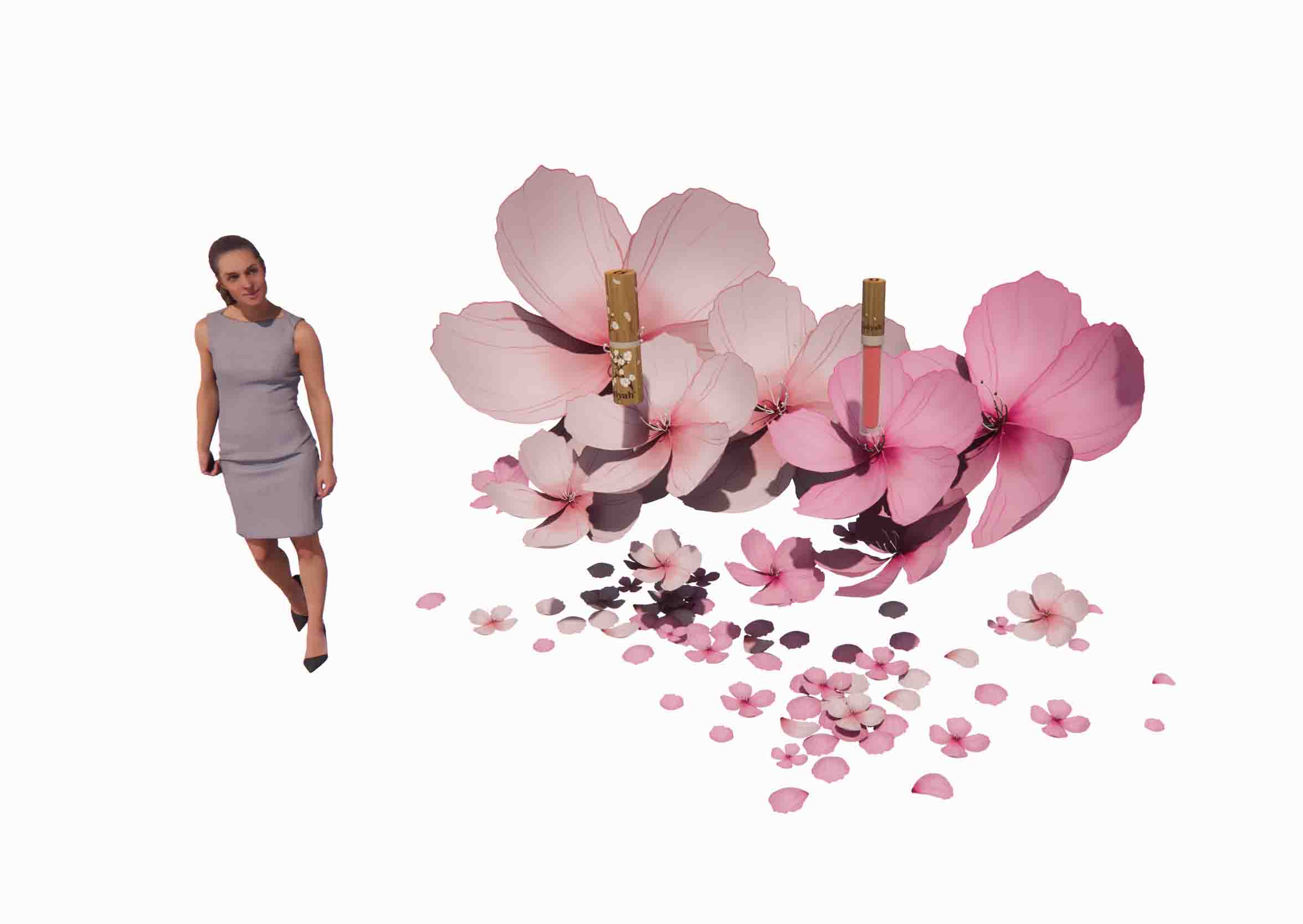

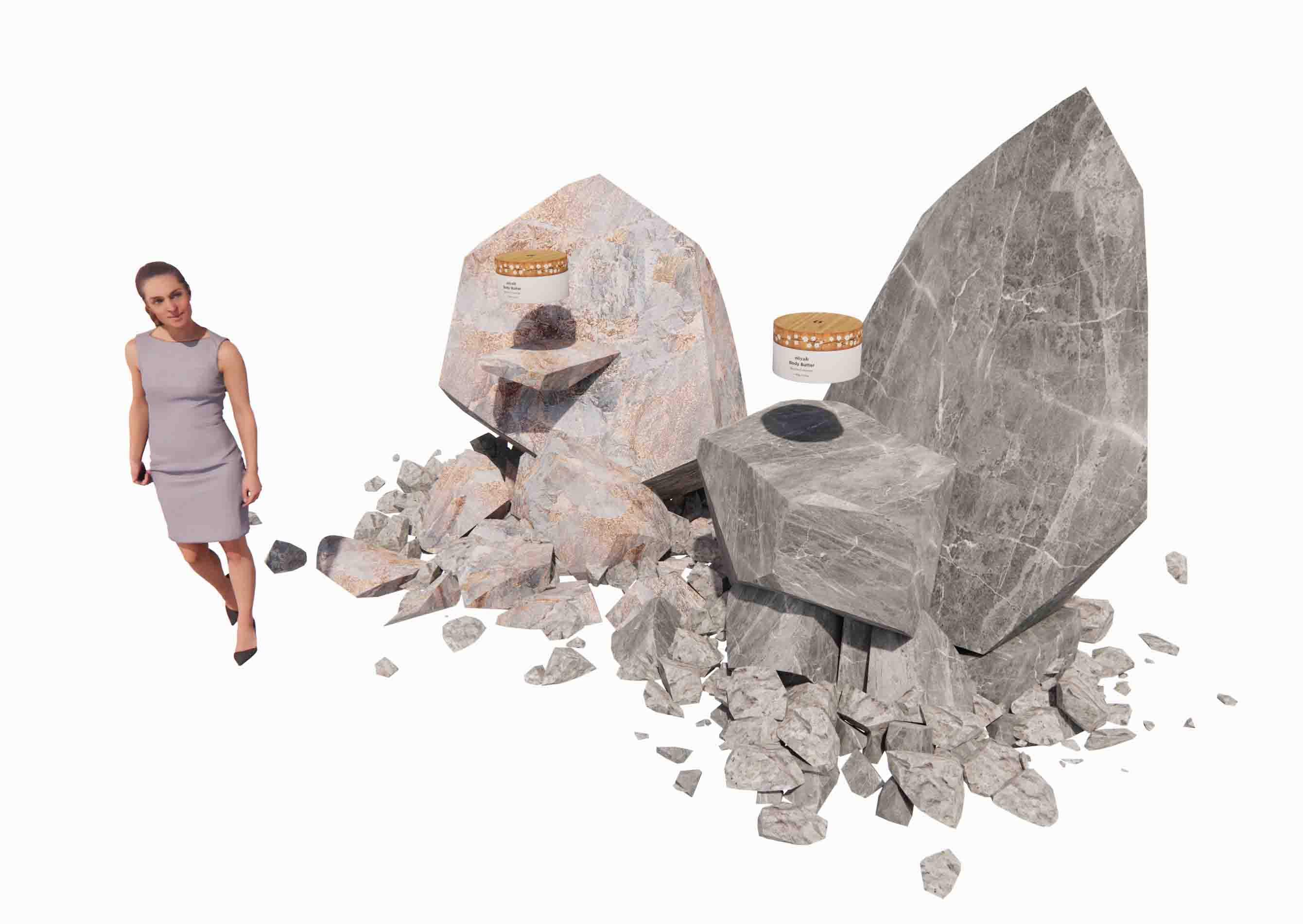
Product Stages - representing the theme of each product line, they are informative and are good spatial signs

Stage layout - representing the idea of the brand, the life cycle. It is simple layout so user can easily navigate.
Spatial User Interface
Spatial UI follows the design system still. However, since the mobile device screen is no longer the only interface, ergonomics is equally important. Meanwhile, information it presents should be highly refined, considering user can hardly hold the phone stably to read each single word. Last, the over design of the UI should match the overall spatial design, and represent the product.
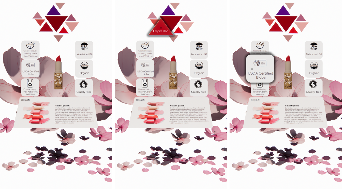
Pop Up Menu
Web end UX is the other important component of the eco system to create seamless shopping experience, it is an extension of the mobile application. Its user flow is similar to the mobile app, with each critical node being carefully designed.
Home Page
Hero image carousel is the first thing users see when they arrive, it is a critical component to establish the brand identity and to set up the tone of the overall user interaction.
So it is designed as an onboarding process, instead of one-directional presenting, many interactive mechanisms were added to it, thus from the first second user arrive, they started to get used to the affordances, signifiers, constrains, mappings, feedbacks, and eventually establish the conceptual model of the website.

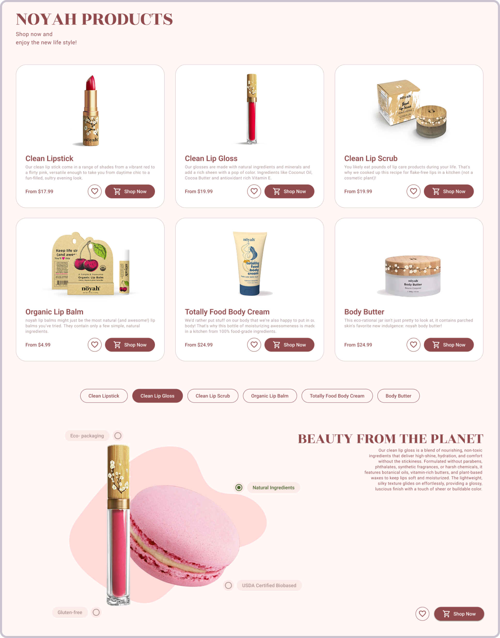
Product Lineup
The product lineup module shares the similar interaction mechanism as the hero image, it also provides users with a secondary path within the information architecture of the website, to easily preview key features of the specific product line, thus facilitate deeper exploration.
PDP
The product page experience is about users recognition through proper discoverability. Beside consistent design system, clear visual hierarchy and utilization of Gestalt principles, product is presented to users in an intuitive way which makes the user experience highly efficient. Also this page shares the 3D model being used in the mobile app, thus cross platform user experience stays consistent.
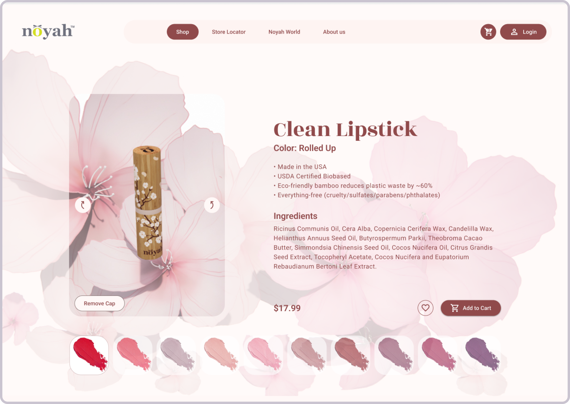

Product Details
The product detail module supplements the main product page, the focus shifts from product itself to its relationship to the brand identify and its relationship to the potential customer, thus to establish the connection between customer, the product and the brand.
Accordingly the feedback we have received, those problems we identified during the reviewing and researching phase have been mostly solved, also key indexes, such as abandonment rate got lowered from 45% to 0%, task time got improved from average 4'25" to average 1'15".The client is happy with what we've done so far, the product now is linked to the Magento systems that was used by noyah web store and it is going to be an very important component of noyah product matrix, providing branding and shopping experience value together with its off line stores over the whole country.
On the web site end, although it is still going through testing, the new user experience design improved the web end performance significantly, the bounce rate got lowered from 43% to 29%.